The Skeleton: Creating the Wireframes (Design Directions)
For our first design sprint, Paul instructed us to each create our own wireframes for the start of this project, so that we could provide the client with various options to choose from. As all of the information architecture we needed to design our wireframes came from Verynice, we initially had some difficulty accessing the documents needed (sitemap, UI kit, assets that Verynice wanted us to use). Also, with each of us creating our own style of low-fidelity wireframes for this iteration, we had to re-edit our final designs as there were some inconsistencies in formatting and fonts used. I noted that this delayed our wireframes by a couple of days - not ideal during a design sprint. We were only able to complete two-thirds of our first iteration of wireframing pages - which prompted Verynice to step in and finish the rest (Click here to see final wireframes). In hindsight, we should have set more realistic expectations of when we would complete our tasks - taking into account the possibility of unexpected setbacks.
 Freedom to Choose Wireframe Website Homepage
The Surface: Creating the Mockups
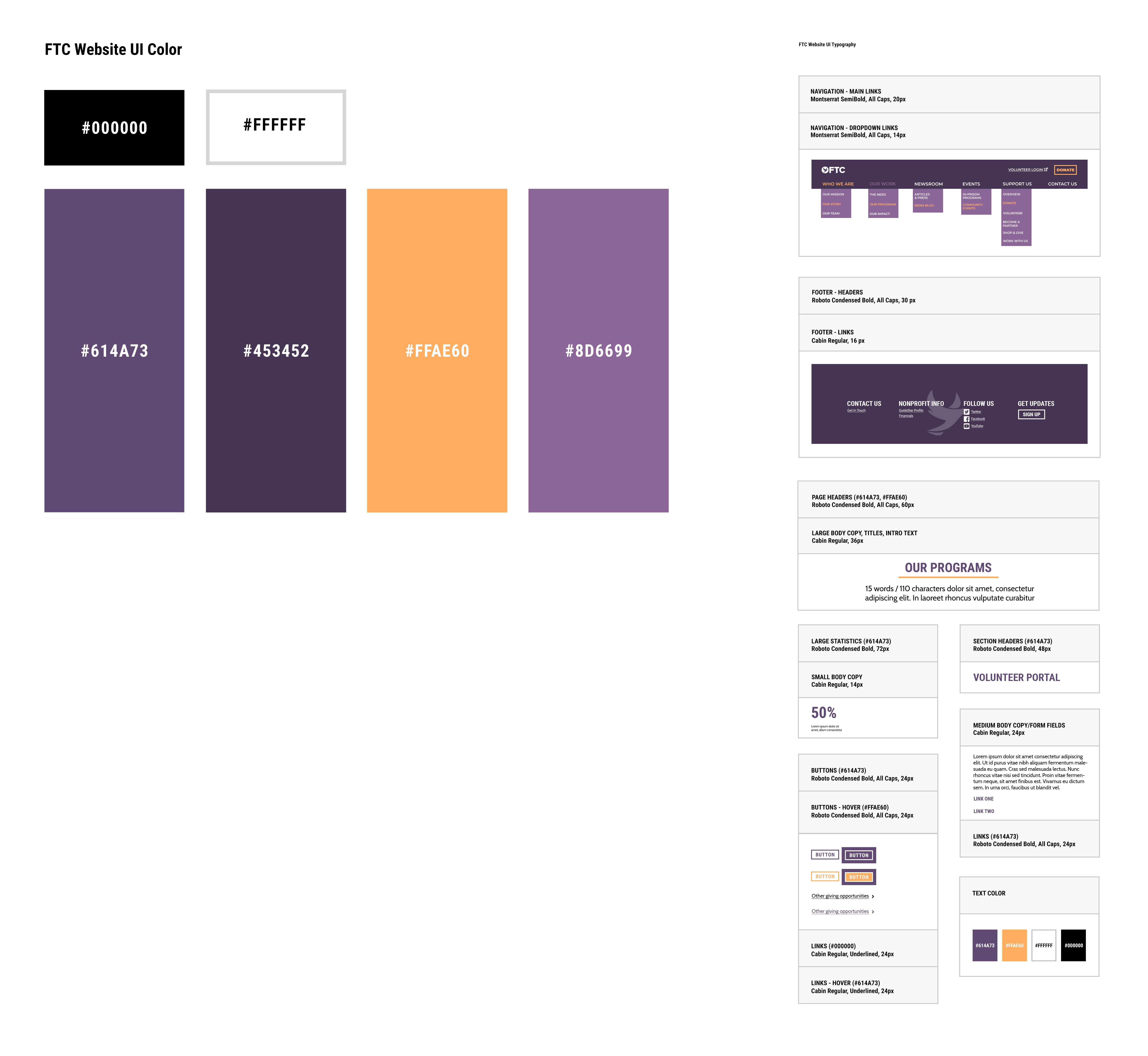
With the wireframing iterations in motion, we began to work on the visual design of FTC. Verynice provided us with initial design directions of the website. We handed off the first iteration of the visual designs to Jacob, to ensure a consistent style for all pages. Eleanor and I focused on creating a style guide for the rough designs Jacob created, confirming the styling was both accessible and responsive.
We found some color pairings within the palette to have a low contrast ratio, which prompted some trial and error on both parts to create color combinations that would meet the standard on the website. After a couple of tries, we finally settled on an accessible design palette for all components of the website.We turned in an initial rough draft of the homepage to Verynice, who provided additional feedback to address before submitting our first iteration of designs.
 Freedom to Choose Style Guide
Due to some miscommunication, we found that our first iteration of visual designs was assigned and due on the same day. However, we initially thought we would have a couple of days to complete this assignment. With the amount of components we had to work on, we found this to be an unreasonable request, but had no leeway into getting an extension. We prioritized and worked on the designs as fast as we could, and were able to turn them in a day after the deadline. With the feedback provided from Verynice and the client, we completed the final iteration of the wireframes during this phase as well, reflecting the changes we made into the final iterations of the visual designs.
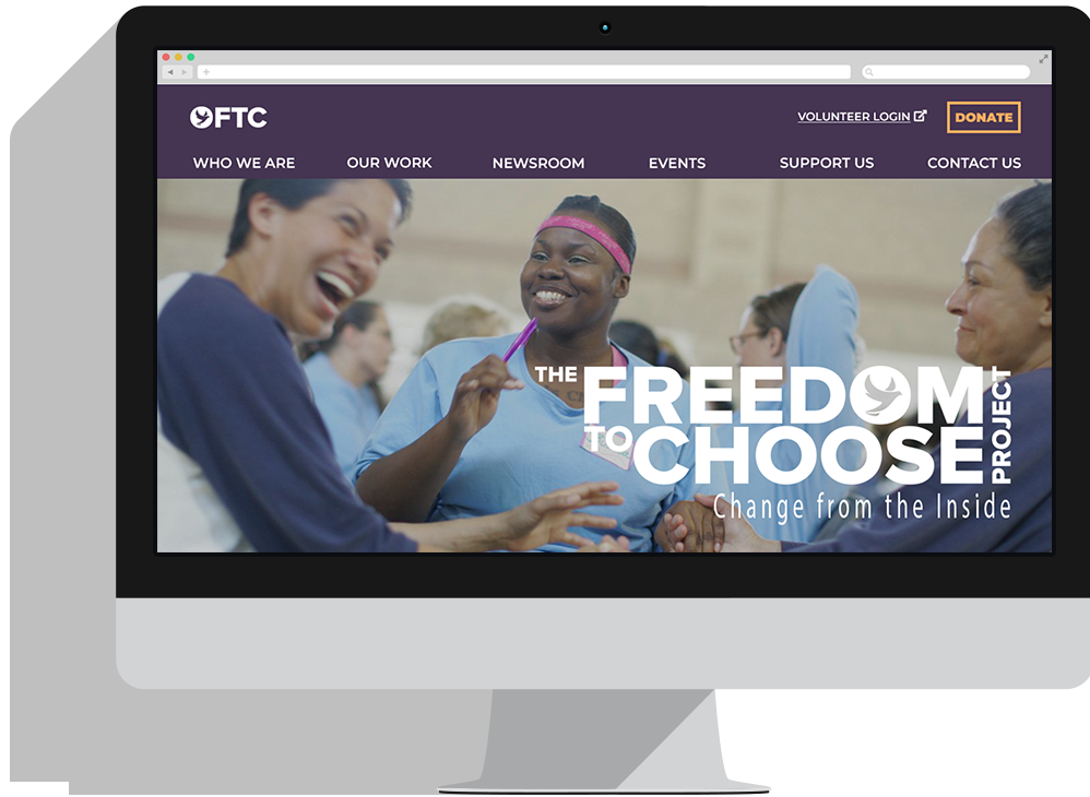
 Freedom to Choose Mockup Website Homepage
As we transitioned into the interaction design phase of our project, we were unexpectedly tasked with designing the wireframes for the mobile version of the website. We quickly designed wireframes for the mobile version of the website, and then proceeded to note the elements and interactions used on all pages of the website via InDesign. For this phase of the project, I highlighted the key elements in all the mockups of FTC’s website, noting the design reasoning behind each. I also noted any possible interactions that could be used, linking the UI code that could be used to accomplish such. As we were still finishing up the final iteration of the visual designs, I had to go back and update the InDesign comments I made previously as well.


