The Scope and Structure: UX Sketching
In this case, I was unable to conduct user interviews, and addressed the design of the application based on the stakeholder’s ideas. I conducted a whiteboarding session with the client, who listed off the various needs she wanted to satisfy in SmartOven. Since this was a practice project, Eleanor and I had some moments where we had to make up the user needs as we went along, but we gathered enough data to begin sketching.
 SmartOven Whiteboarding
The Sitemap
After completing the whiteboarding session, I gathered the data and organized it into a sitemap. This helped me establish the framework of the product. I divided the menu into four categories, in what I assumed would be easiest way for the user to find the content they were looking for.
 SmartOven Sitemap
I set up a basic sketch of SmartOven, categorizing the information into five menu items:
1. Dashboard
a. Alerts
i. Examples
1. Time for bake
2. Oven malfunction
b. Temperature & Humidity Graph
c. Live Bake Feed
i. Managers/Administrators would have baking controls:
1. Temperature
2. Humidity
3. Timer
2. Bake Log
a. Bake Schedule
b. Bake History
3. Recipes
a. List of Recipes
b. Add/Edit/Delete recipes option
4. Oven Admin
a. Baking controls for manager (This section was removed during the wireframing phase, since it is found in the Live Bake Feed section)
5. User Admin
a. Edit permission/access rights per employee
b. Add/Edit/Delete employees
c. List of employees
Since employees do not have administrative rights, they would only be able to access the Dashboard, Bake Log and Recipes sections. I sketched out various ways to display the features and components, giving me enough to work with for the wireframing portion of the project.
The Skeleton: Creating the Wireframes
After whiteboarding the basic layout and content of SmartOven, I created low-fidelity wireframes of each menu item listed above. I started out using Adobe XD’s Wires UI kit, adjusting it to improve its usability. I expanded on the content of the cards in each dashboard, specifying how the information will be displayed as well as the key details of each card. I focused mainly on the content and navigation, making sure the dashboards followed a consistent format.
 Wireframe - Dashboard Home - Manager View
I found myself having issues with figuring out how to intuitively design the oven controls for adjusting the temperature, humidity and timer. I initially used arrows, but felt that didn’t make sense considering the context of the functions. I thought also about applying skeuomorphism, using dials like an actual oven, but felt that didn’t translate well to control through a desktop screen. I looked up some digital oven designs for inspiration, but found they also had fairly confusing interfaces, so I drew from the parts that worked well. I settled on using +/- buttons as I felt that in the context of using an oven, representing the oven controls as such was the most intuitive.
 Dashboard Bake Log - Bake Schedule - Calendar View - Manager View
The Surface: Creating the Mockups
I realized a large part of the mockups phase was understanding what the personality of the product should be. I tried a few color palettes and fonts, but I got stuck and realized I had to answer a few questions first.
1. What is the feel and personality of the product, and how does that translate into the visual design?
2. Is that personality catering to the users and goal of this product?
 SmartOven Mockup Pattern Library
I realized that having a good understanding of the personality of your product correlates to how your visual design looks. After talking to the client, we concluded SmartOven should feel like a sleek product with minimal design to mirror how simple and efficient the product is. Looking back, I should have first focused on curating a design brief of what the features and personality of the product was, as well as a set of design principles to figure out what the experience of using the product should feel like to a user.
As I delved more into the final designs of the product, I found more questions cropping up:
1. How will this design help the user navigate throughout the product?
2. How do I present the edit recipe mode in a way that fits the theme of the design?
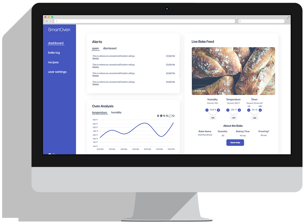
I decided to use the blue as a highlight color of the main functions per screen, with the darker blue used to differentiate from the other functions within the screen. After some inspiration, I decided to keep the edit mode simple, using dash-lines around the text data to indicate that it was editable. I also did quick research into what a typical baker’s schedule is like, in order to represent real content.
 Dashboard Home - Manager View
I wanted to show visual interactions in my prototypes (Manager View and Employee View) because I felt it fully embodied the user experience. The underline animation for the menu items is a subtle, but effective way to show the product’s simplicity, as well as adding a delightful experience for the user. I kept the buttons simple, as I did not want to overcrowd the product with fancy animations that would distract the user.


